We never seen so many companies vying for users who want to have a pie in the so called social web sphere.
This is not the first time were we are seeing so many companies offerring the same service / app in different formats. Off-late many of the old players are redesigning their web offerings to take on the disruptive upstarts.
It happened with the following, where the existing players were challenged & eventually upstaged by the new entrants:
- Blogger vs Wordpress vs Tumblr
- Yahoo & Hotmail vs Gmail
- MSN Messenger vs Skype {Before MSFT acquiring it}. Hangouts is trying to take on Skype with the latest unified messaging
- Symbian & BB vs iOS & Android
- IE vs FF & Chrome
- Flickr vs 500px vs Instagram
- Dropbox vs Box vs GDrive
- MySpace vs Facebook & G+
Over the last couple of years after the explosive growth of mobile phones across the world, the internet has turned from content consumption to content generation. There is so of much user generated data across various web applications that we have surpassed all the data from the dawn of civilisation. As Eric Schmidt says, "We create as much information in two days now as we did from the dawn of man through 2003".
Here is an infographic which depicts a day in the life of internet.
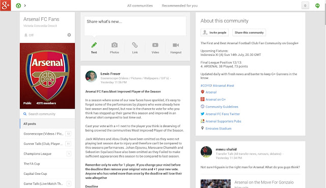
Now when we have so much of data, we need a good UX to represent it. We keep witnessing UX changes with many web apps & off-late mobile apps too. Of the numerous apps, Social Networks keep users actively engaged with - sharing, likes, comments, tweets, instagrams, pluses, RTs, etc. In order to attract New users & turn them into active participation companies are Now redesigning applications. Google revamped Google+ offering last week which looks like 3 column Pintrest-styled offering and today we see Flickr UX look like combo of G+ photos & 500px.
There is more to UX design than what meets the eye. I like the way Om puts it:
I don’t know James, but my sense from reading his post is that he approaches design through a visual lens. Unlike him, I am not a designer and so my way of thinking about design is influenced by not mere visual aspects, but also how things are constructed. I don’t just love the shoes because of how they look — though that matters — but I also look at where the leather comes from, how it is stitched together and what kind of craftsmanship has gone into it. From shoe trees to little patterns on the toe to the packaging to the font on the label, all of those little things add up to the design aesthetic.
I have come across many Existing Users who have welcomed the new UX changes to G+. While few lamenting the design change. In case of Flickr, few loyal users are upset with the UX & others are hurt over the current 1TB free offering, while they have been paying for their Pro accounts for years. However, with New entrants go through Paradox of Choice deciding which service to go for & remain loyal. It takes a bit of experiment with an App before one concludes whether UX is more important over feature offering. There is no Universal answer on how a person decides what is best. UX definitely plays a major role in creating the stickiness with an User.
Here is an insight into what went into thinking of redesigning of Google+. Om chats with Fred Gilbert, lead designer of Google+
Gilbert explained that when Google started working on the new look, the idea was to take a lot of information and show it in as simple a manner, giving the eye the visual cues to understand the importance of content. Bigger photos, for instance are indicative of their importance. Photos become bigger based on analysis of past relationships to the people and the content and their ensuing interactions, Gilbert explained.
Underlying these visual cues are a lot of data analytics. This data-informed design is actually a clever approach and the wave of the data-informed design. Gilbert said that usually when companies undertake a redesign of their website, it is based on some kind of data they have collected over a period of time. For Google+, data is informing the design, except at a much faster speed and is hyper-personalized based on who you really are. “Data and design have to be used together to tailor experiences,” said Gilbert.
Application, be it web or mobile, is getting more personal in the manner we use. We act as curators, choosing what we like to consume from various sources to be Social. It would be great one day where data-informed applications can recommend / suggest what goes well with our taste. Need to see how well Google+ fares in recommending contextual content with #hashtags.
Only time shall prove it, if brand new UX { or unlimited data offerring } will get New Users or upset the existing Loyal Users. One thing for sure, companies need to keep innovating & competitive against the upstarts to remain active in business.
~ G+ Community Page ~
~ Facebook Page ~
~ Flickr Stream ~
~ Google + Album ~
~ LinkedIn Home ~

~ Google+ Home ~
~ 500px Home ~
~ Pinterest User Page ~
Labels: 500px, BigData, Design, facebook, Flickr, google, hashtags, linkedin, pintrest, social_media, twitter, UX


